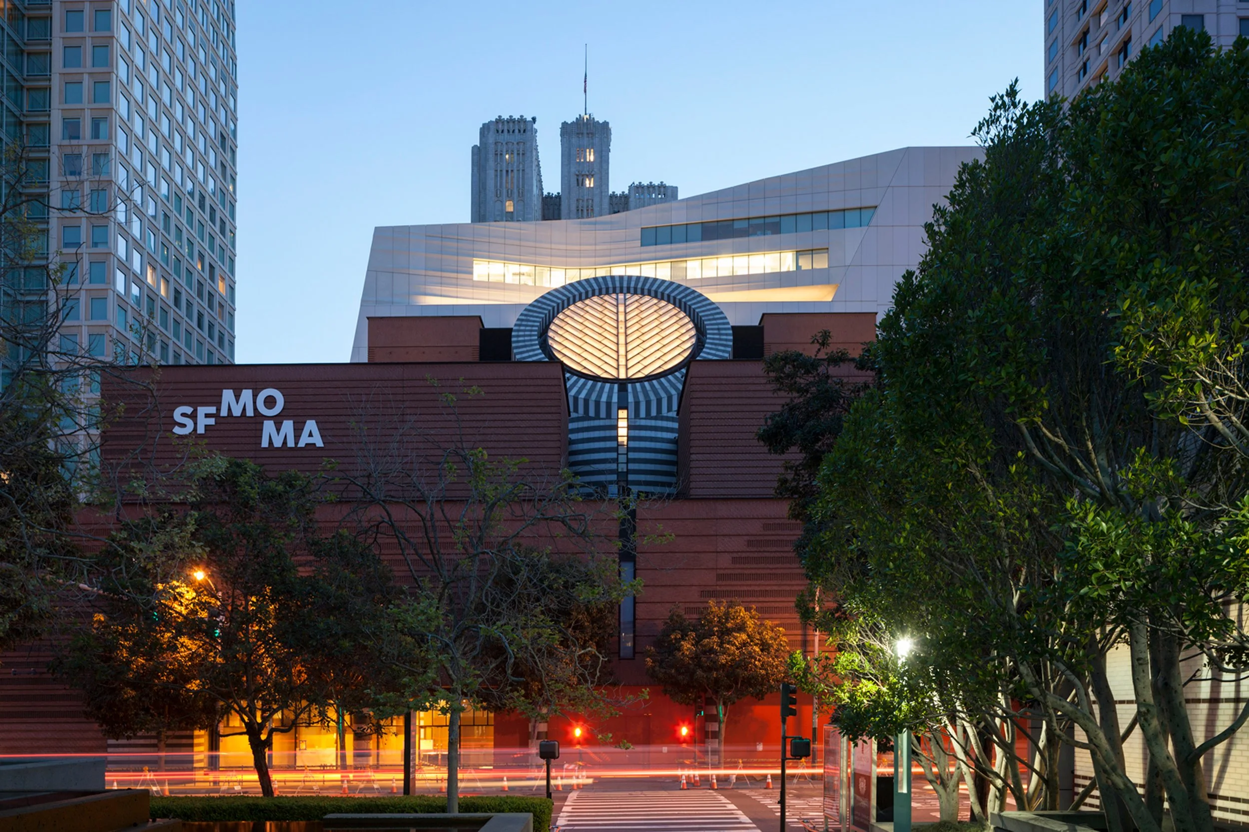
San Francisco Museum of Modern Art
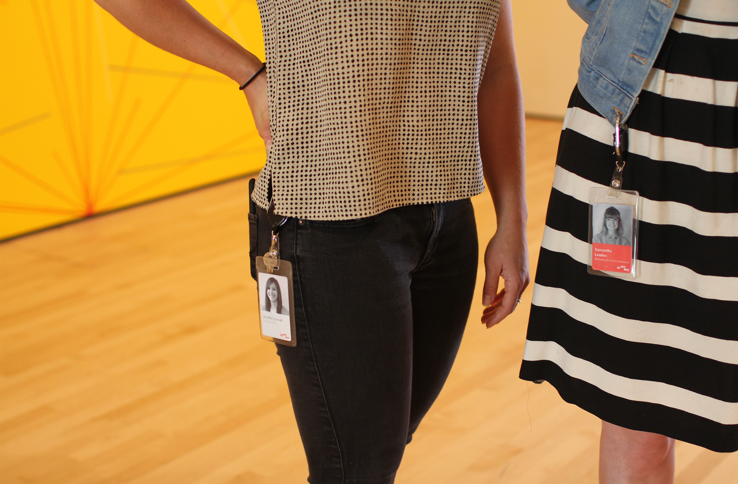
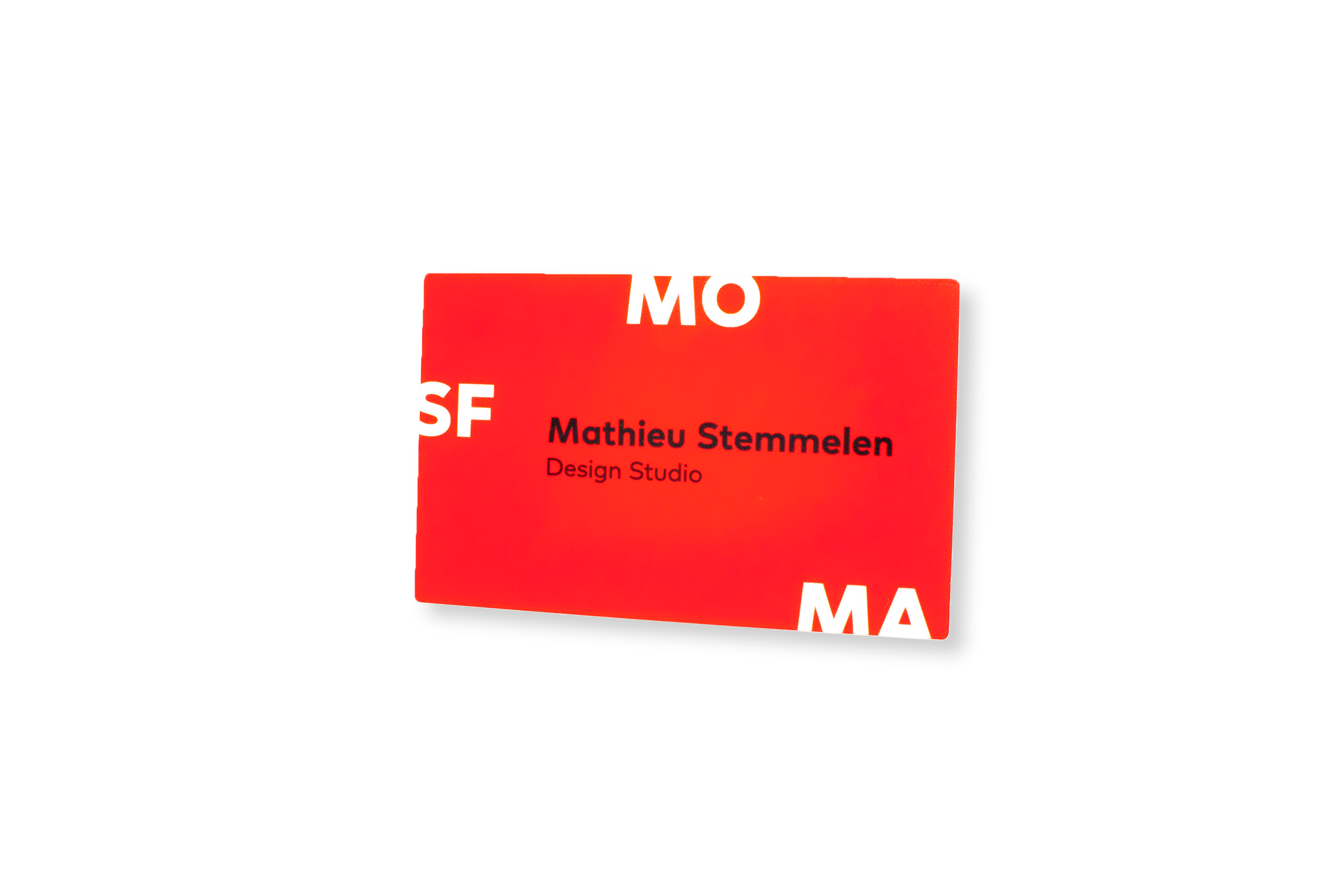
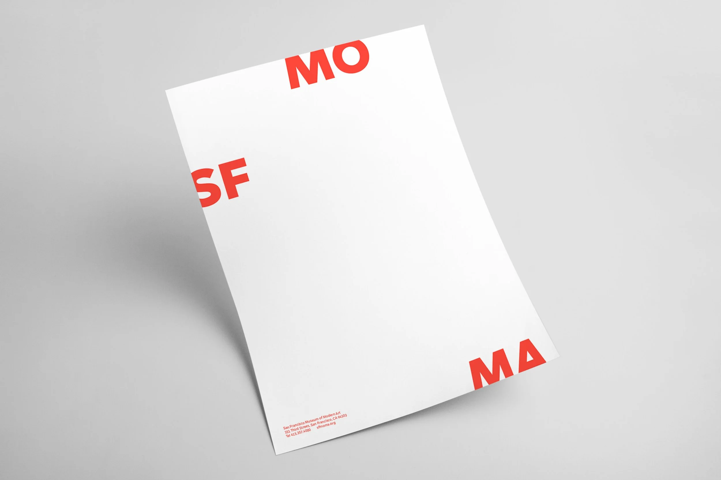
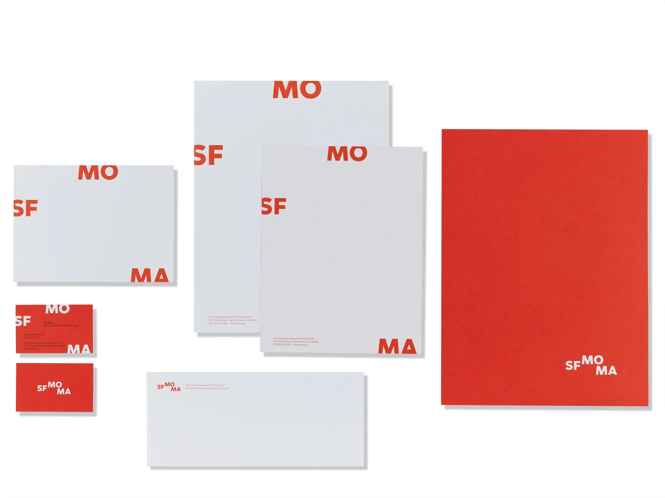
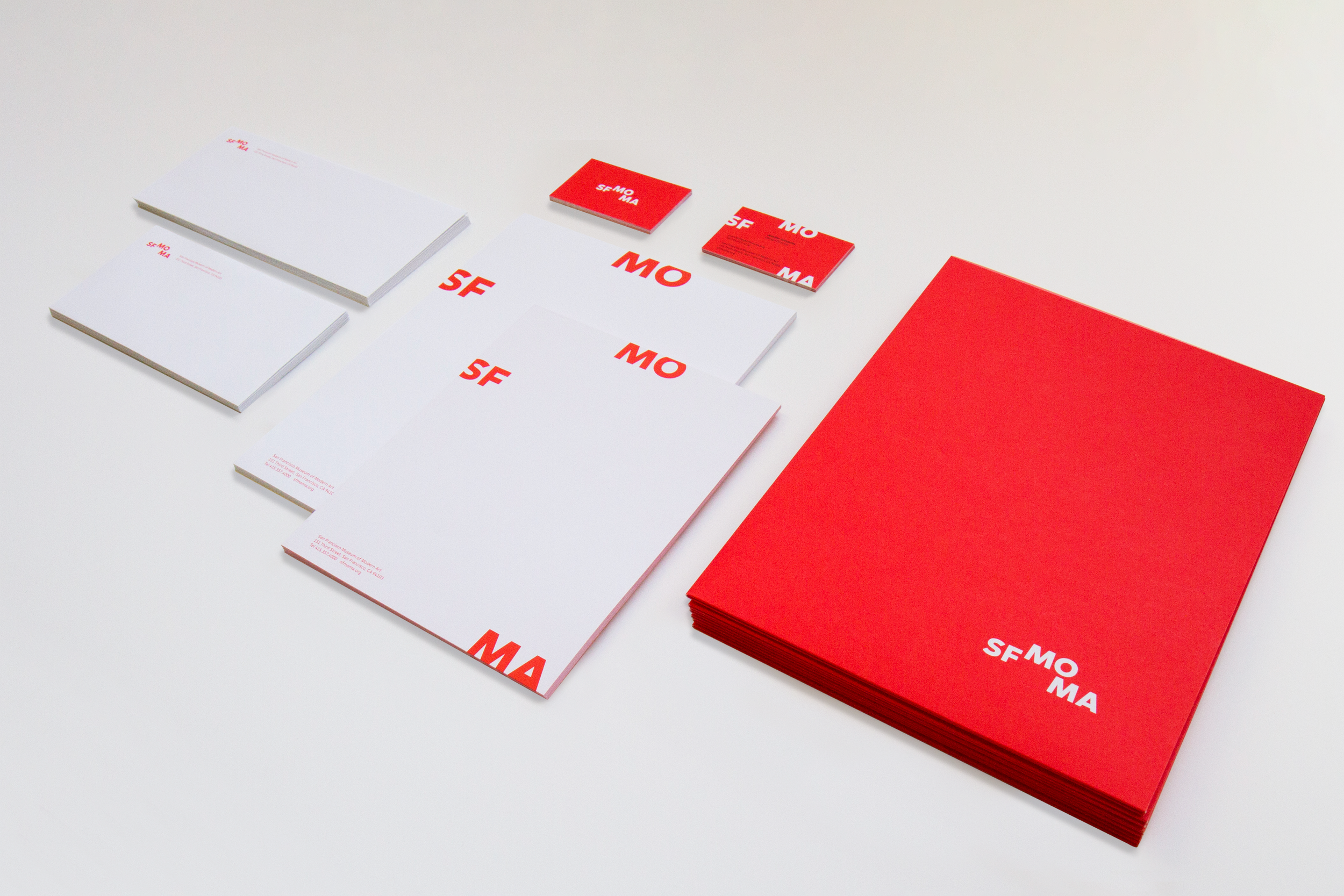
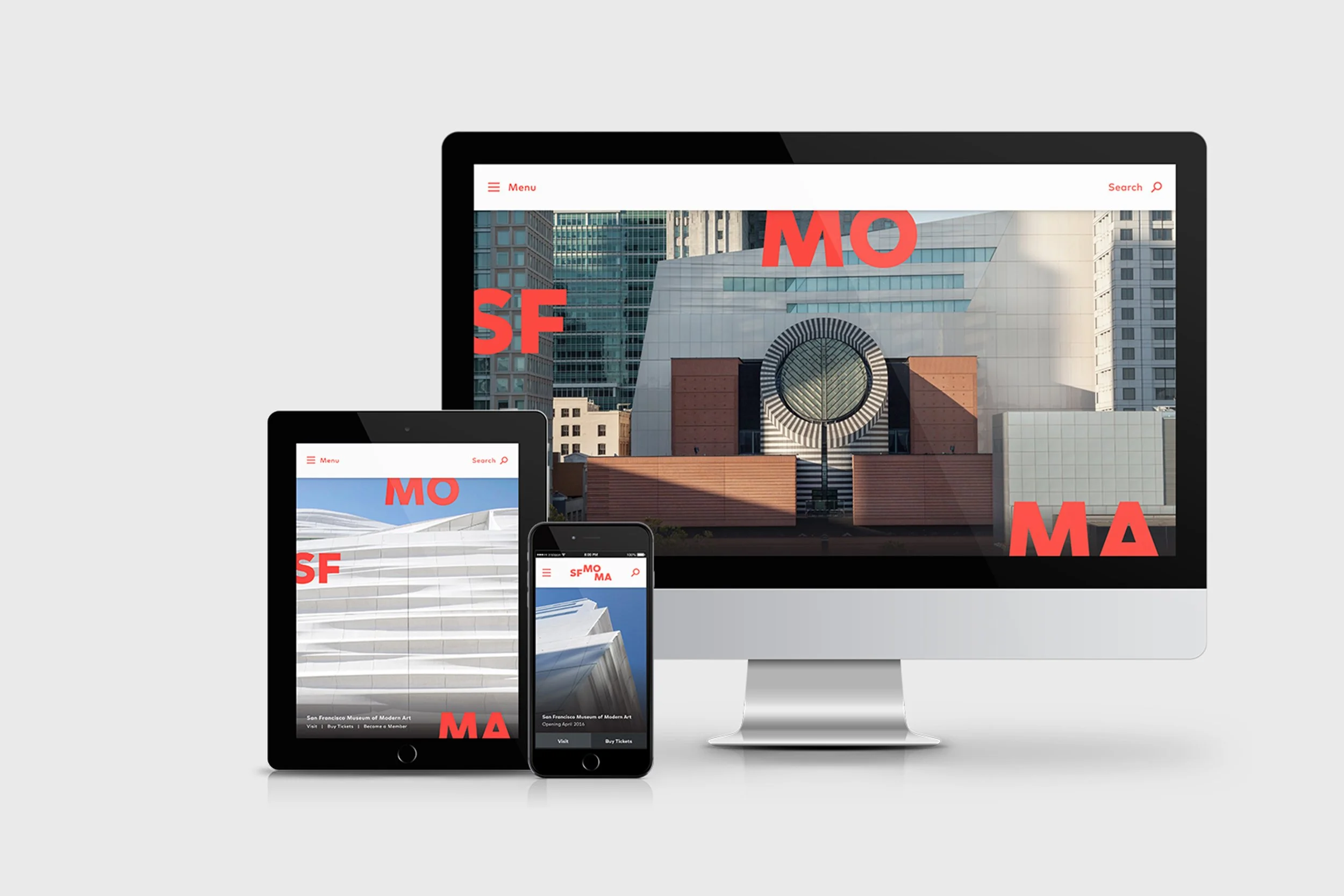
A complete in-house rebrand for the San Francisco Museum of Modern Art. Executed by our team of 5 creatives, the project consisted of a new logo, custom typeface, color palette, website and digital style guide, architectural signage, print collateral, Museum Store products, and more. To introduce the live brand to the market, the project included a complete identity redesign, a system to work across multiple applications, brand guidelines and production-ready files. The dynamic logo, which expands and contracts when applied to various mediums earned international recognition and multiple awards, including the International Design Awards, Communications Arts, Graphis, HOW In-House Design, and many more.
——
Brand Strategy, Brand Identity, Brand Launch Campaign, Brand Messaging & TOV, Product Design, UX design, UI design, Website Design & Development, Print and Packaging Collateral, Iconography, Signage, Wayfinding
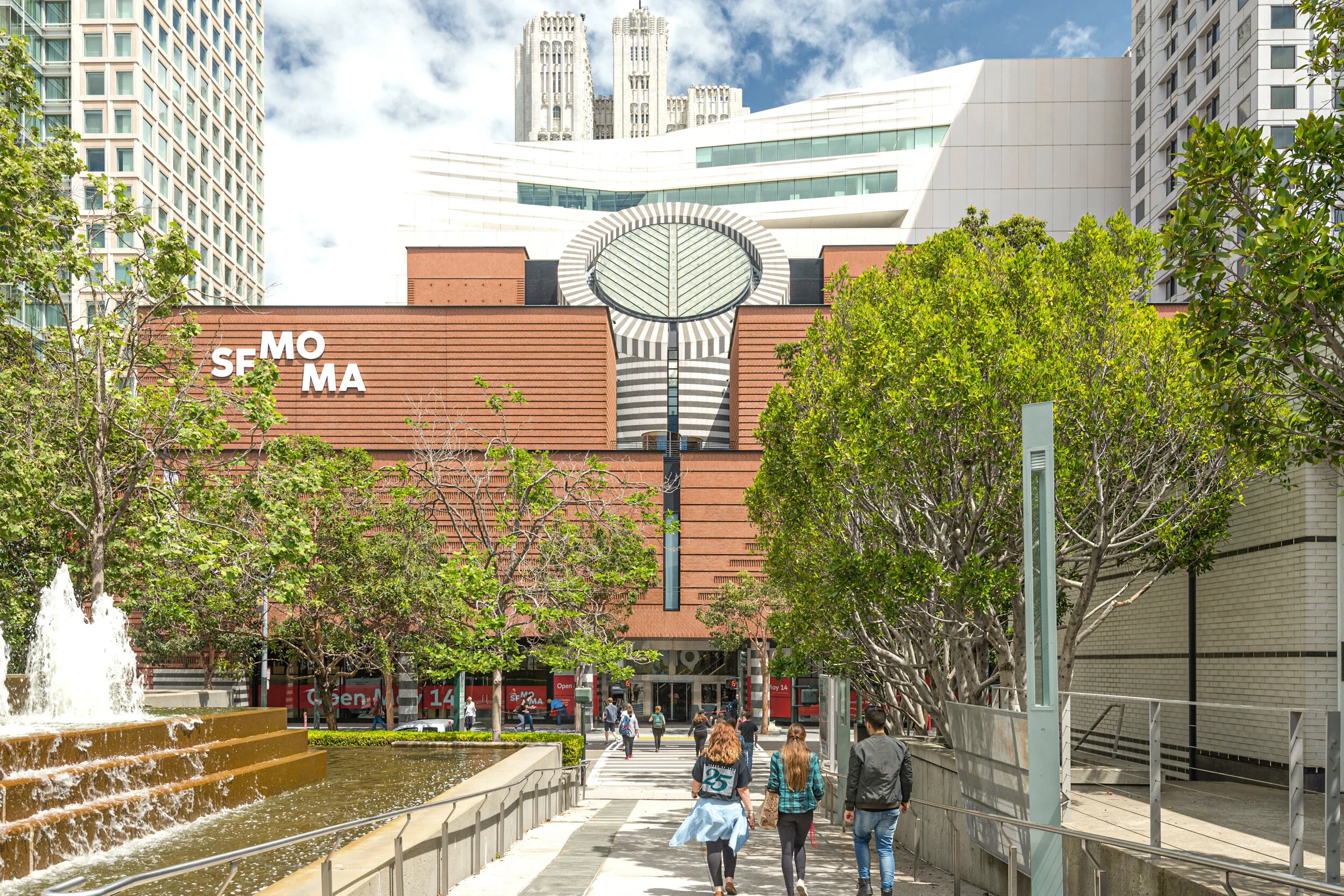
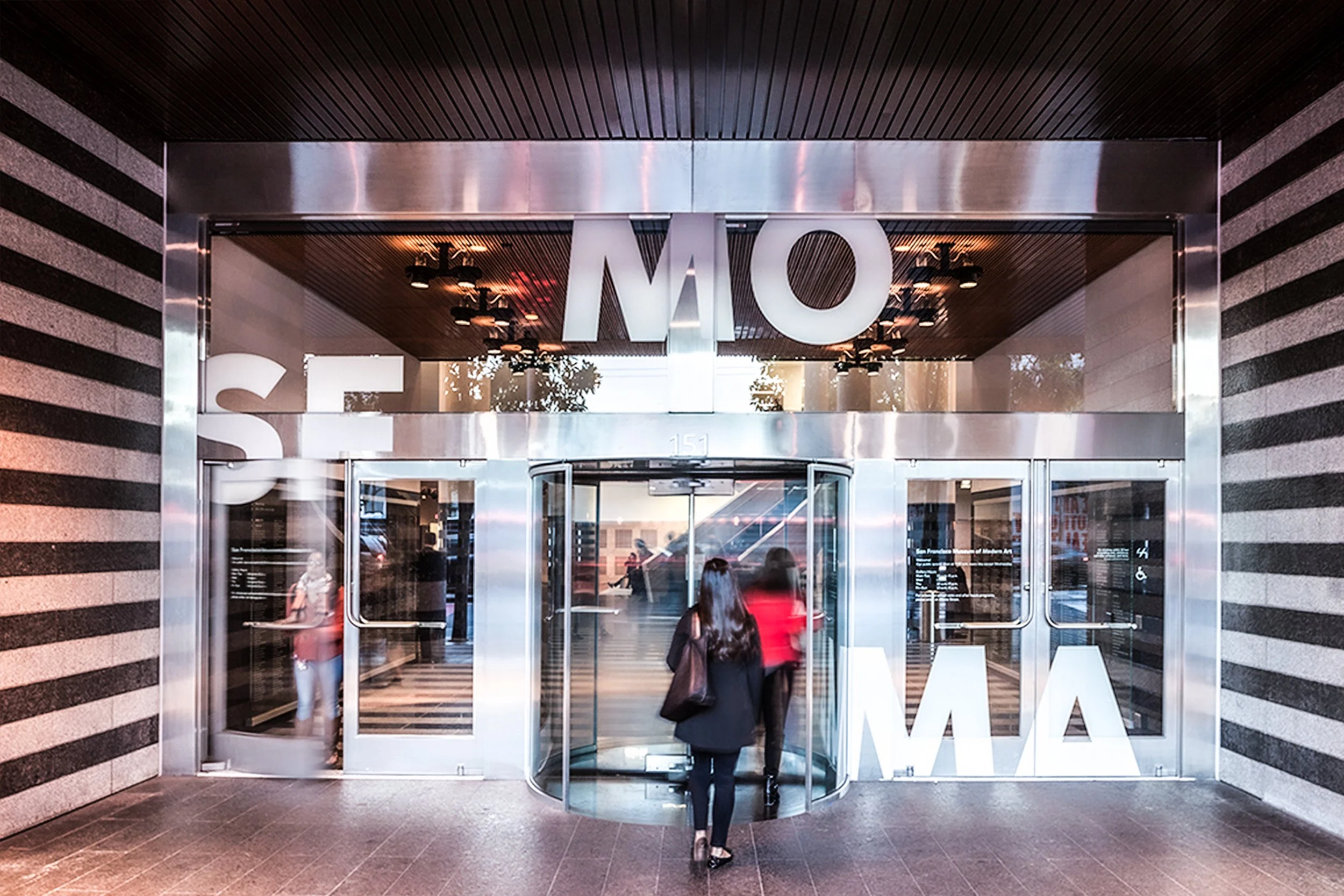
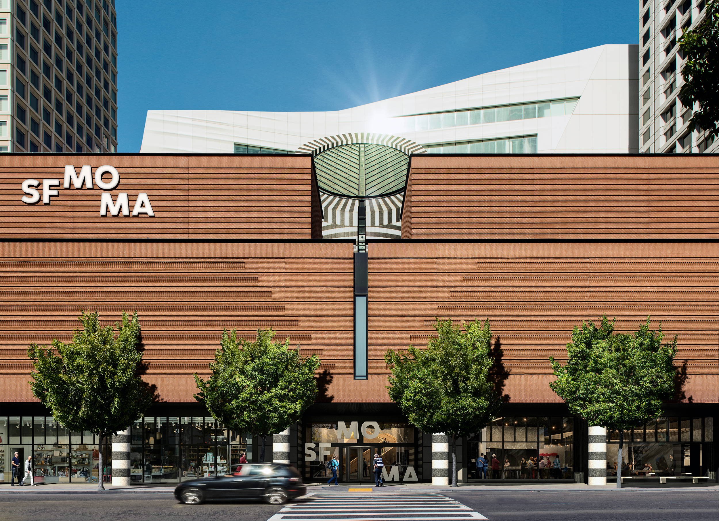
Similar to its Snøhetta-designed expansion, the new visual identity is designed to be porous, open and welcoming, providing multiple points of access.
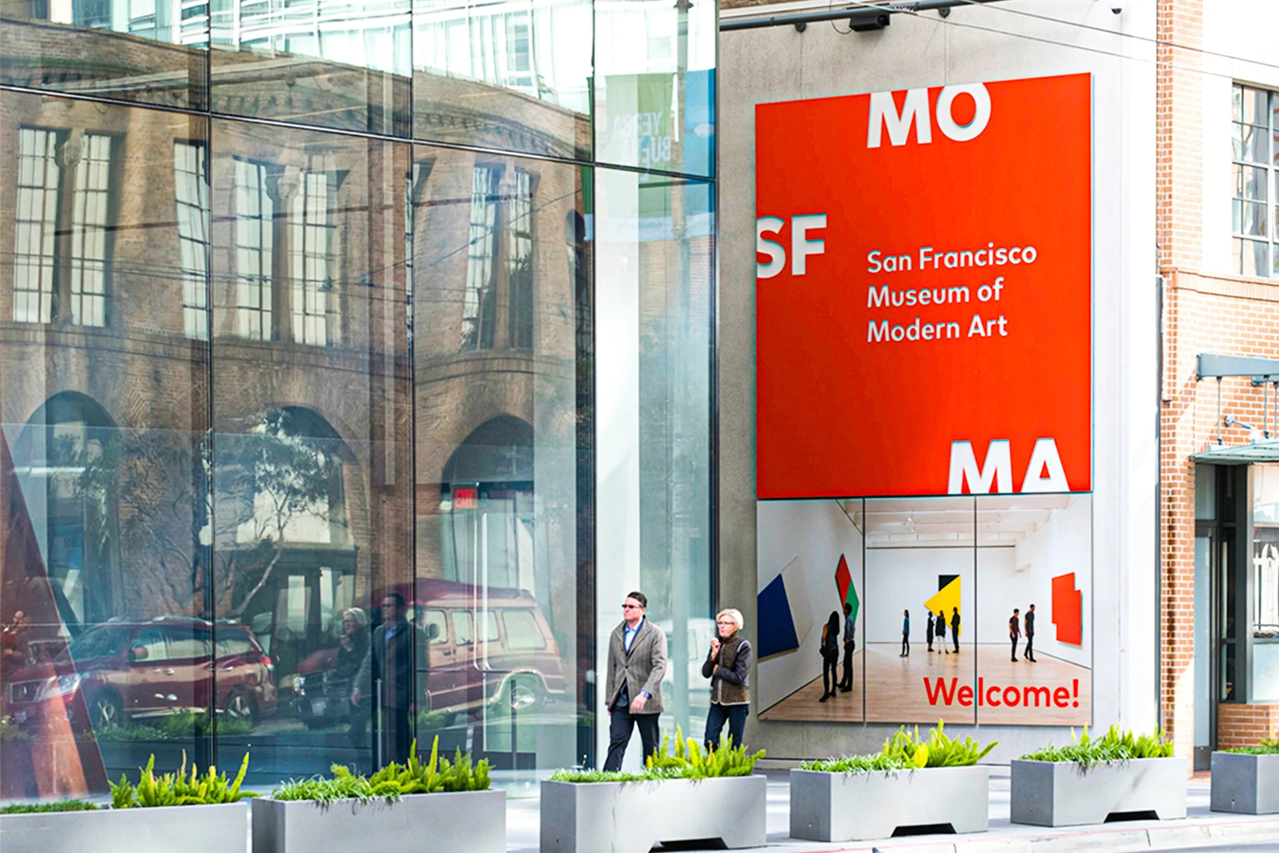
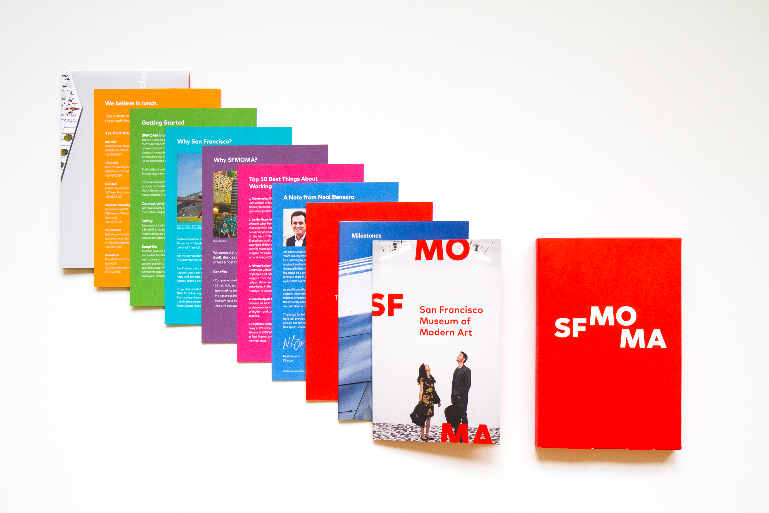
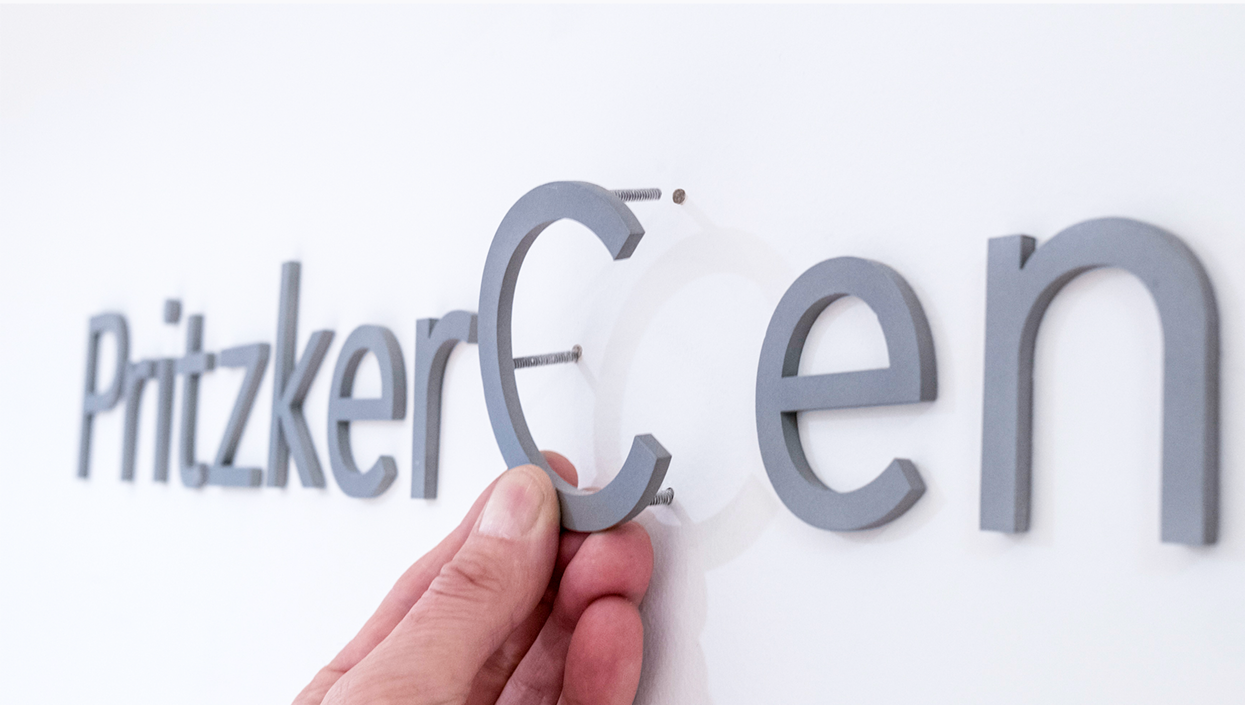
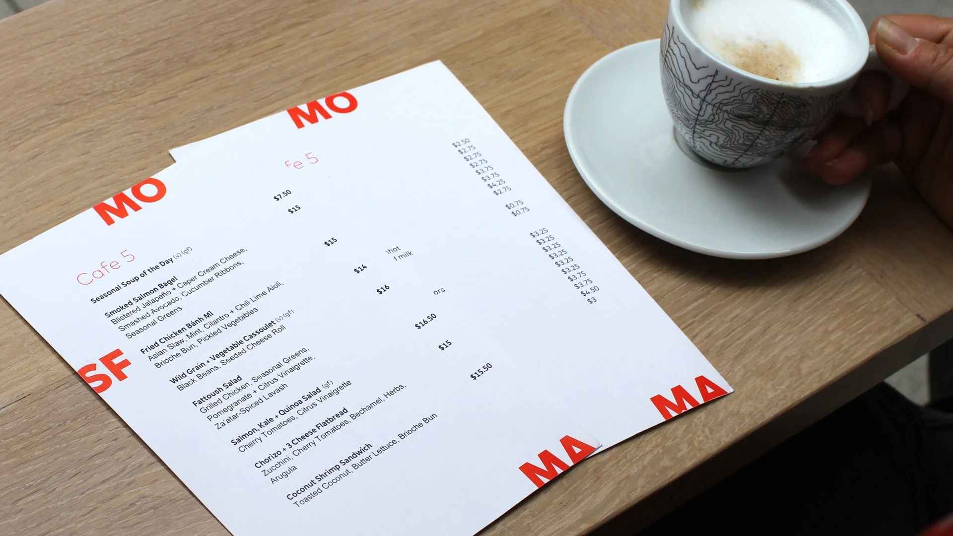
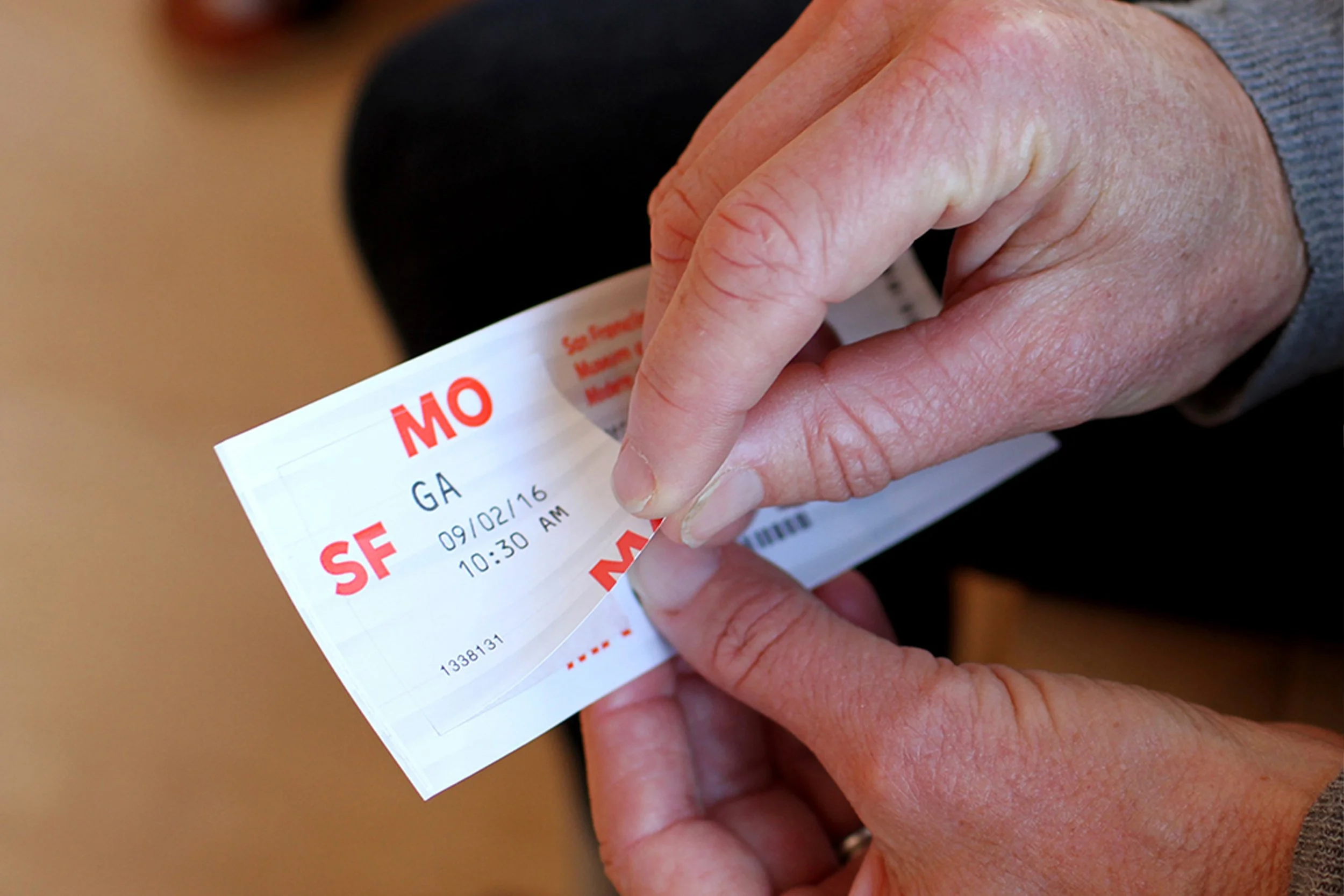
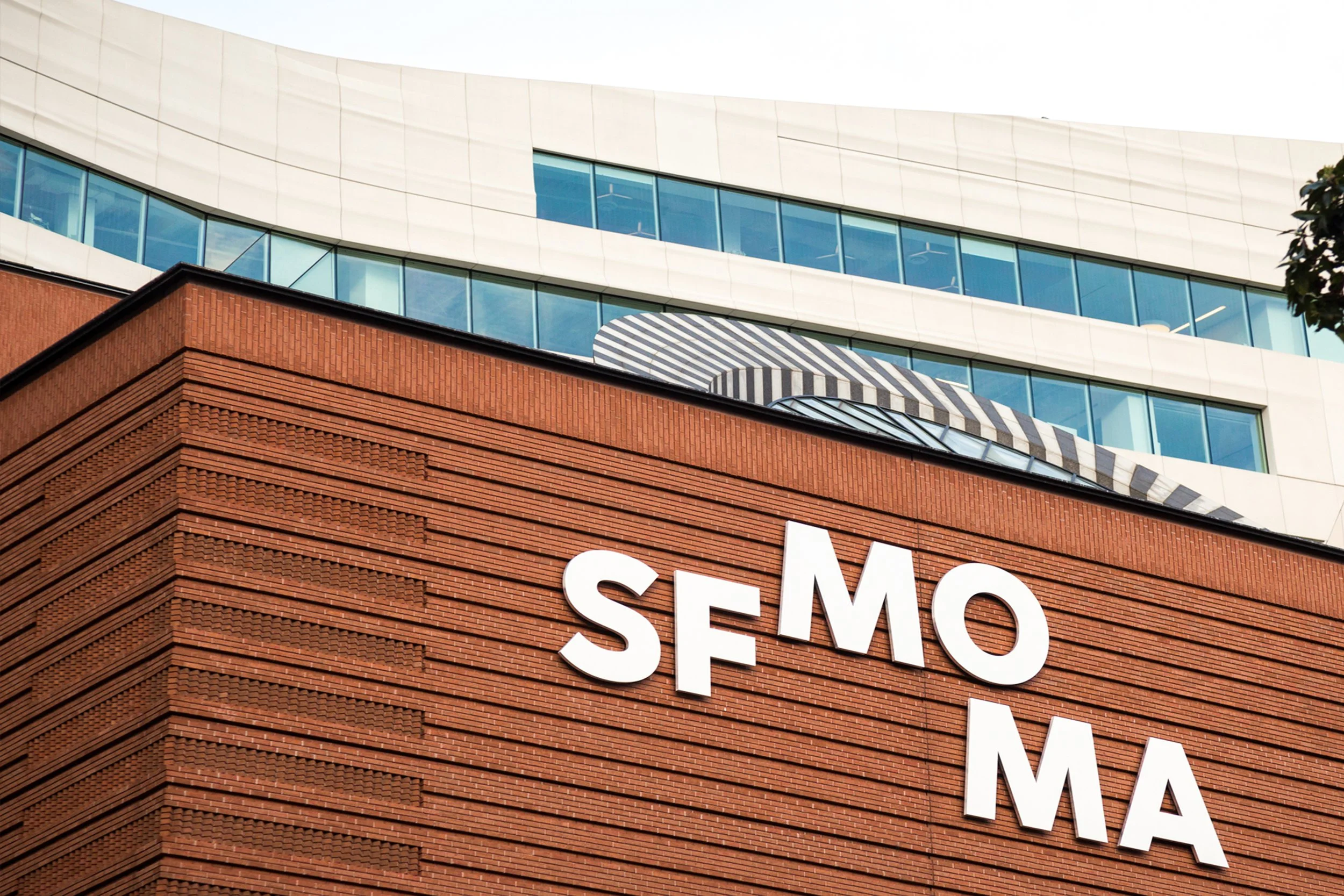
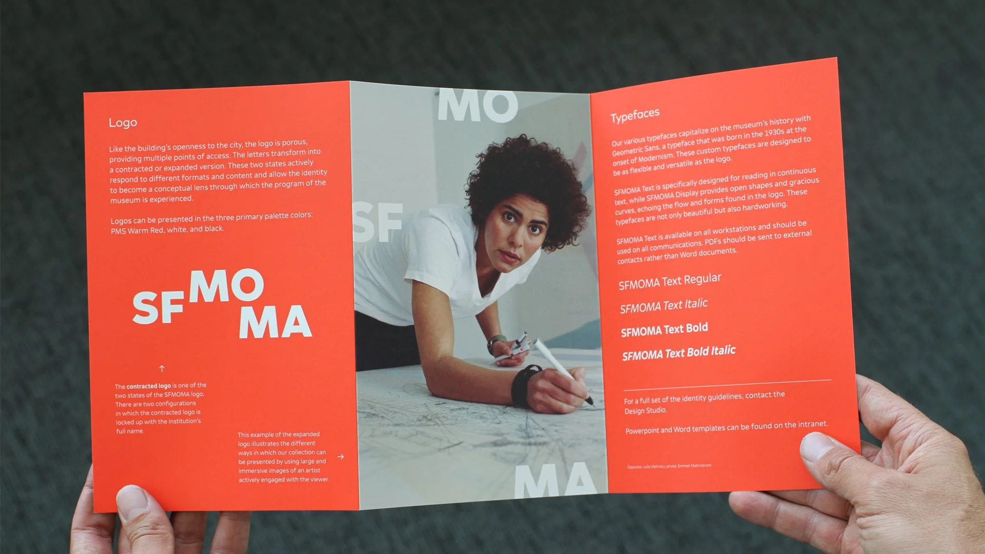
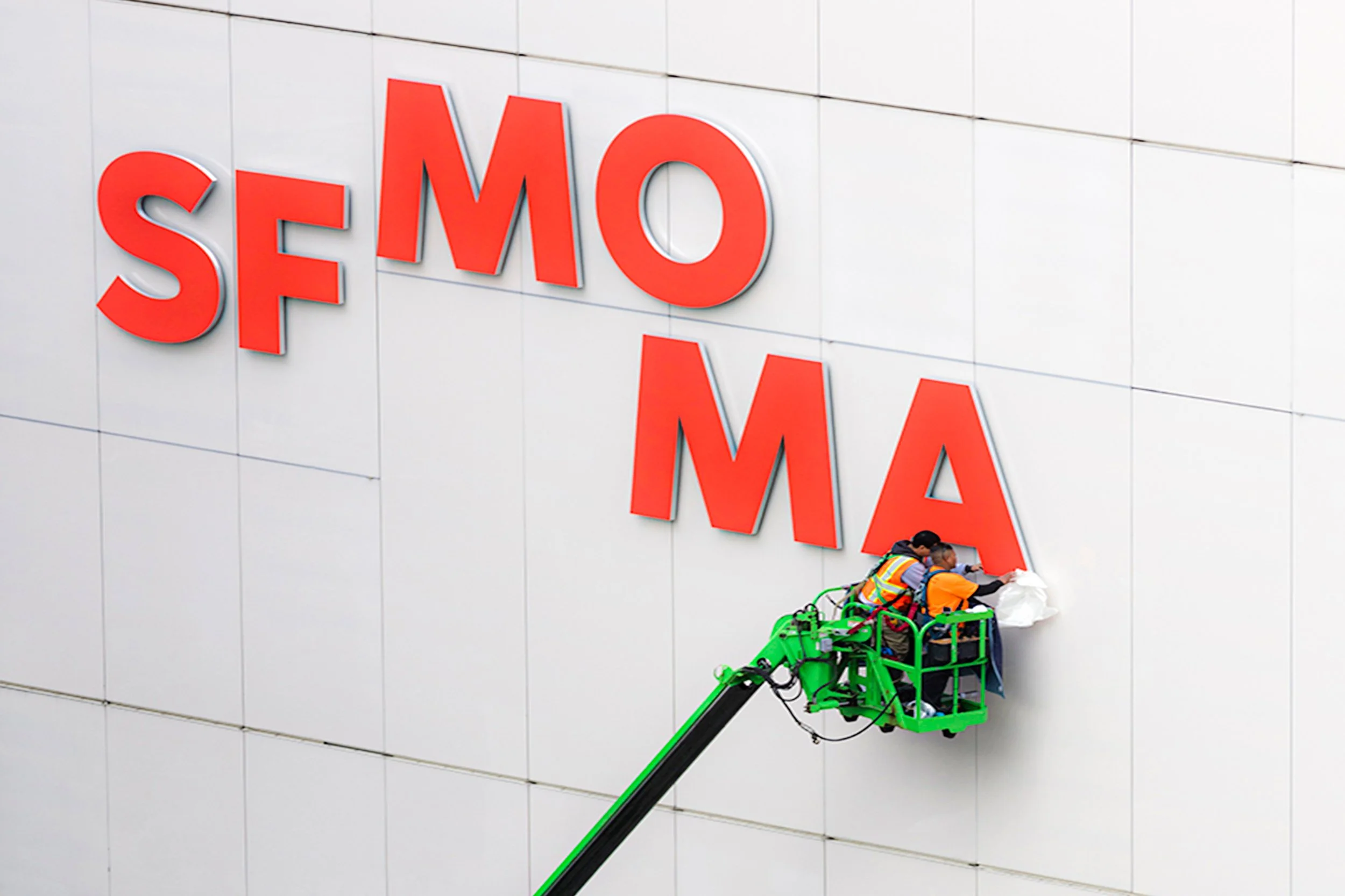
The letters of the new logo contract and expand, and their positioning and versatility aims to reflect diverse perspectives on and within the institution.
On a functional level, the new logo is more space-efficient, allowing greater scale and legibility on everything from small digital screens to large street pole banners to the exterior of the museum.
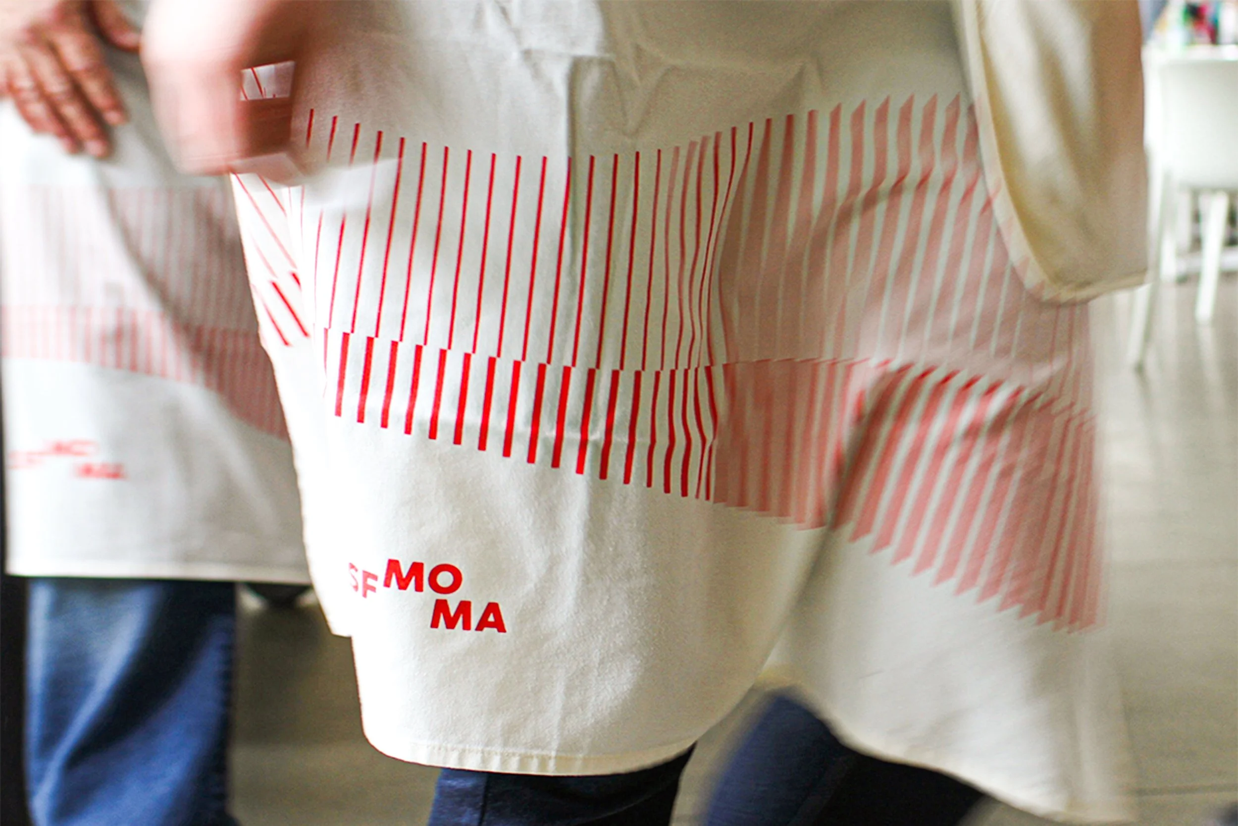
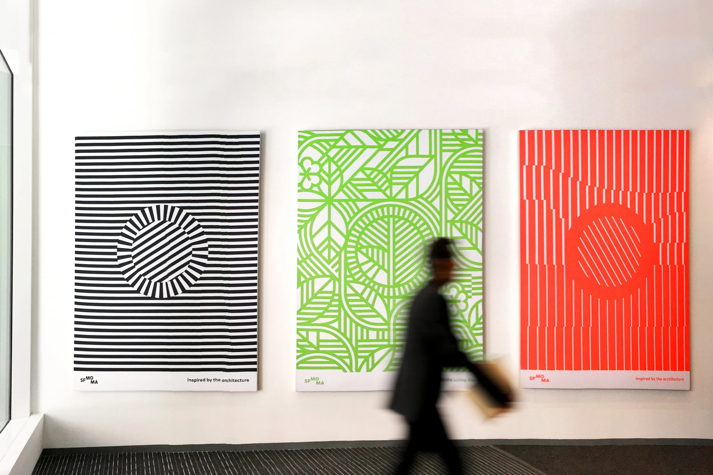
To celebrate the architectural joining of the original building and the new expansion, we created graphic patterns combining the horizontal stripes of the Botta building’s iconic oculus and marble floors with the rippling lines of the Snøhetta building’s façade.
Like the design of its expansion, the museum’s new visual identity was inspired by the surrounding hills and the water and fog of the San Francisco Bay.
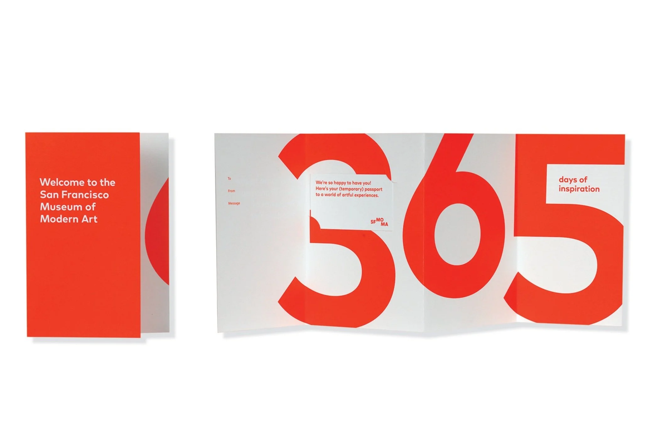
Echoing the contrast between the Botta-designed brick and the cool white façade of the Snøhetta expansion, the primary color palette of the new visual identity includes warm red, black and white.
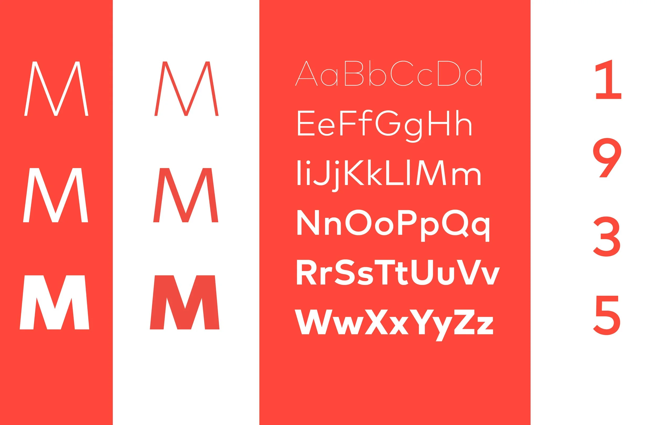
An essential ingredient of the new visual identity is the custom typeface. It serves as the glue, providing distinction and cohesion throughout the entire program. A very flexible typeface was required to address the museum's specific needs,— a wide range of contexts and requirements, from architectural signage to long-form reading in books to legibility on digital screens.
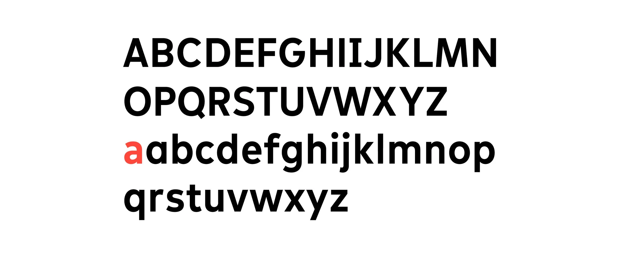
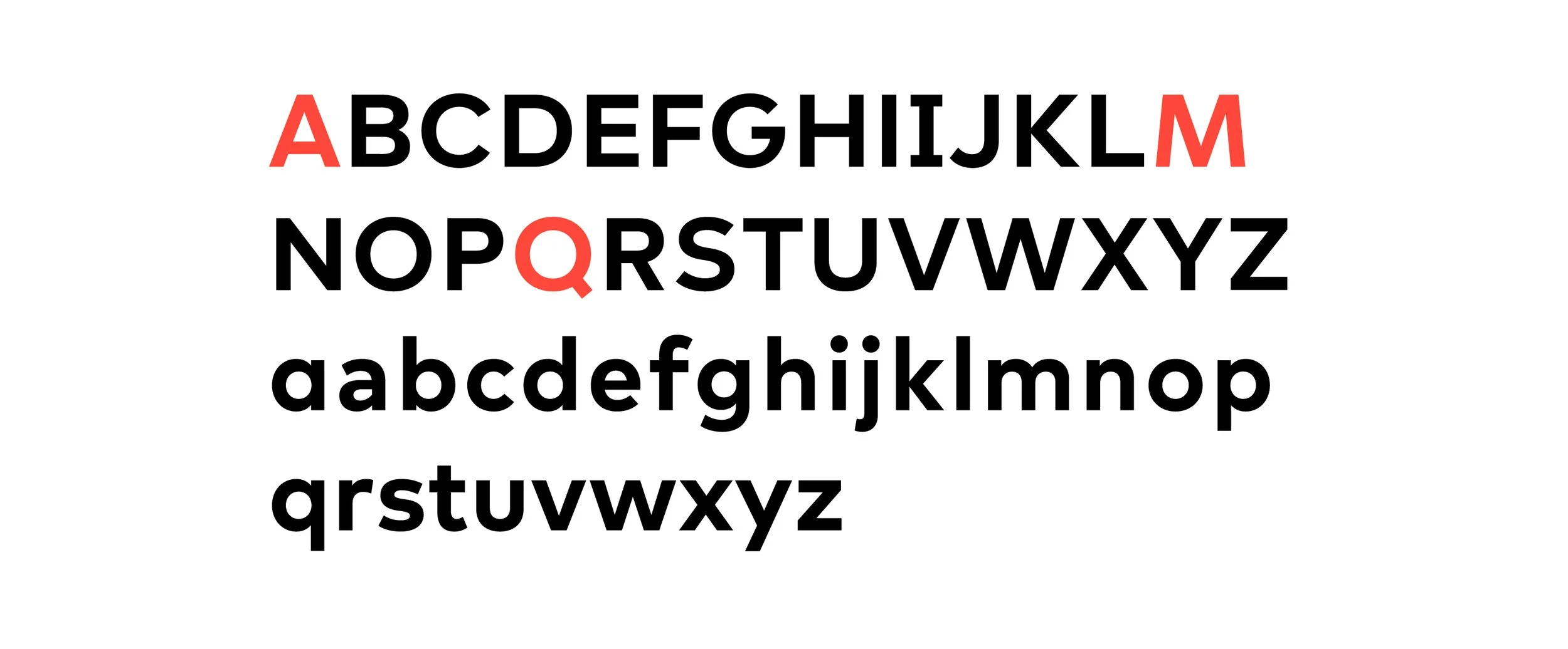
Two variations of typeface were custom designed to dialogue with the new logo: SFMOMA Display and SFMOMA Text. SFMOMA Display mimics the open shapes and curves of the letters within the new logo, distinguished by the splayed legs of its “M,” the lower counter of the “A,” a sleekly modern “Q” and the curvature of its capital “S.” SFMOMA Text elongates the letters, eliminating perfectly round circles to enhance readability, and provide the functional range necessary in order for the two typefaces to cover the wide range of needs of the institution.
The letters in our logo served as the inspiration for SFMOMA Display, which adopts their open shapes and gracious curves. SFMOMA Display is distinguished by the splayed legs of its M, the lower counter of the A, and the sinuous curves of the capital S. And be sure not to miss the sleekly modern Q!
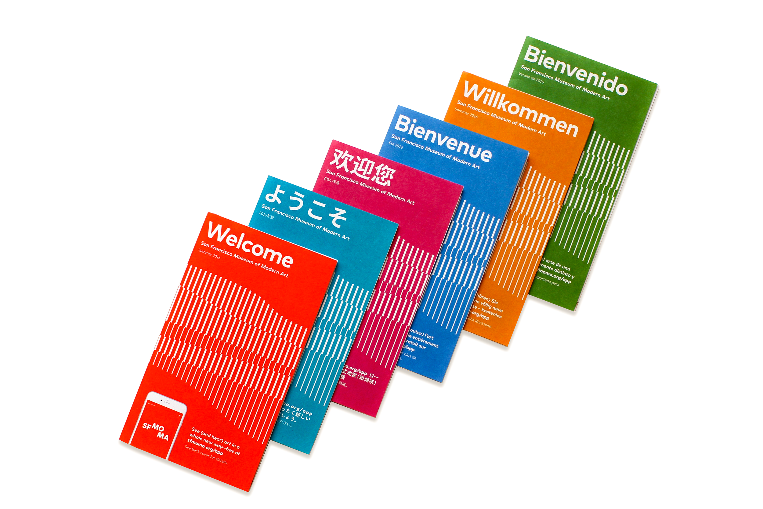
Icon family and wayfinding system were developed as a specific language for the visitor guide
Wayfinding icons were developed specifically for the project using the SFMOMA typeface as a basis.
Wayfinding signage installed directly on the elevator doors
To align with the progressive mindset of the Bay Area and uphold the institution's values, the Family Bathroom sign within the family icon collection features a non-conventional depiction of a family.
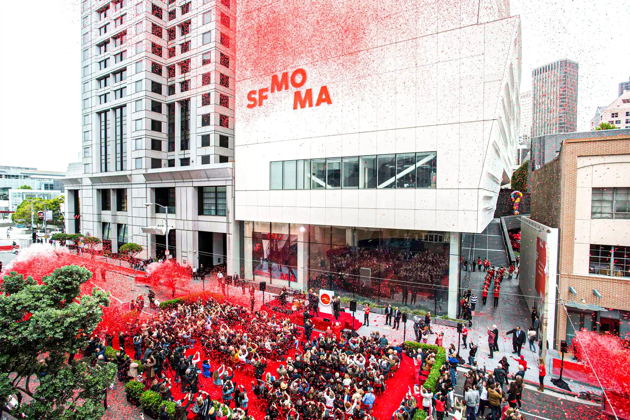
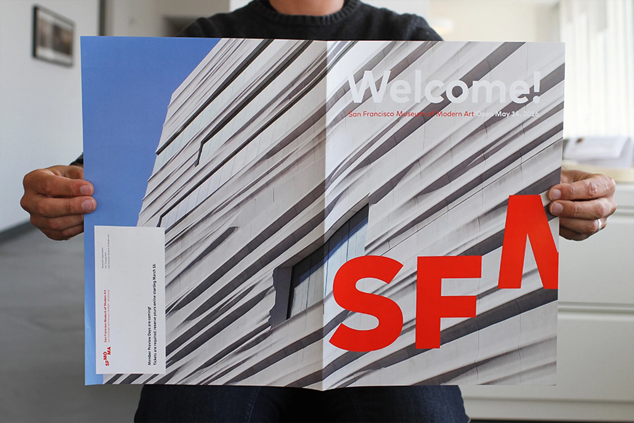
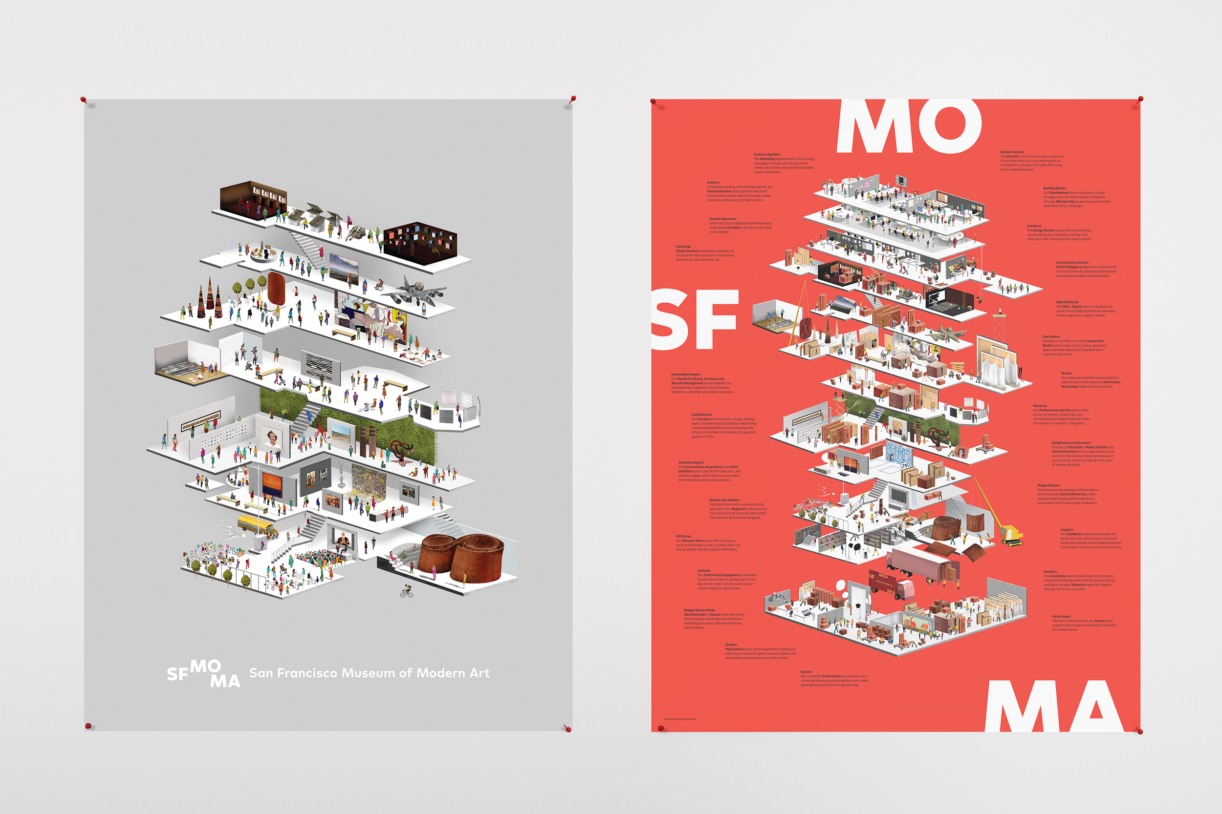
Double-sided poster created for the launch of the new museum.
SFMOMA’s former logo—developed in-house by Catherine Mills in 1995—was informed by the geometry and solidity of the Mario Botta–designed building. The transformed museum now anchors a vibrant cultural district in the heart of the city. SFMOMA felt it was the right time to redesign the logo to better reflect the expanded institution, its new brand, and its relationship to its surroundings. This translated into a new visual identity that literally opens up just as our building now does to the city, welcoming visitors for a wide variety of experiences.


